Olive & Bean

Branding a cafe with big bakes and an even bigger heart.

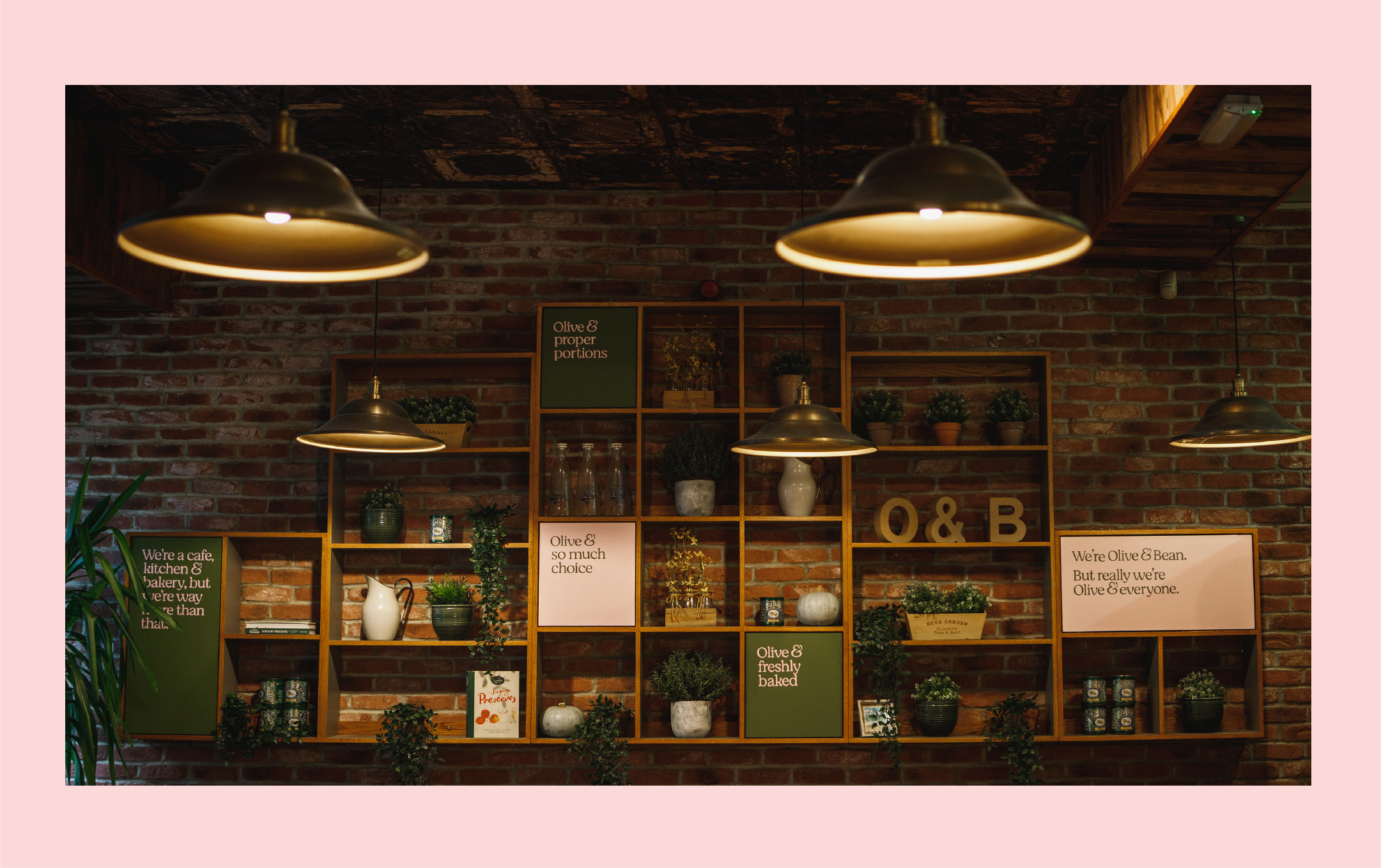
After almost 20 years in the heart of Newcastle, Jane’s independent, female-owned café, Olive & Bean, was ready for a fresh look and feel. A local favourite known for big bakes, generous portions, and even bigger smiles, the brand needed to reflect its roots – a café woven into the fabric of Newcastle.

Working with Mam’s the Word, we built a new narrative around Olive & Bean’s welcoming ethos: to be a place people return to, time and again, for consistency, quality, and comfort.

At its heart sits the ampersand, a symbol of connection, community, and the little moments that bring people together. Because We’re Olive & Bean. But we’re always something more.

Cafe branding

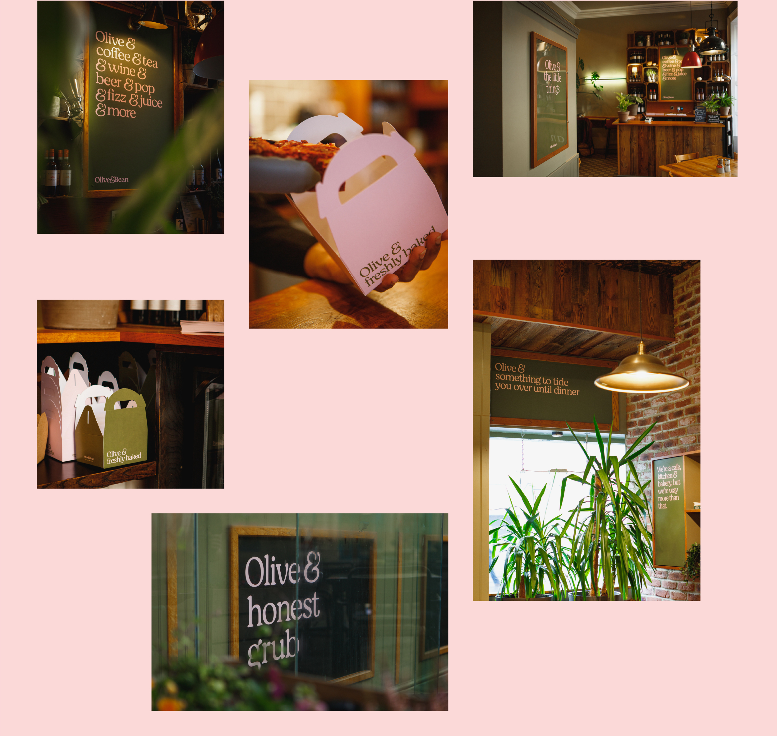
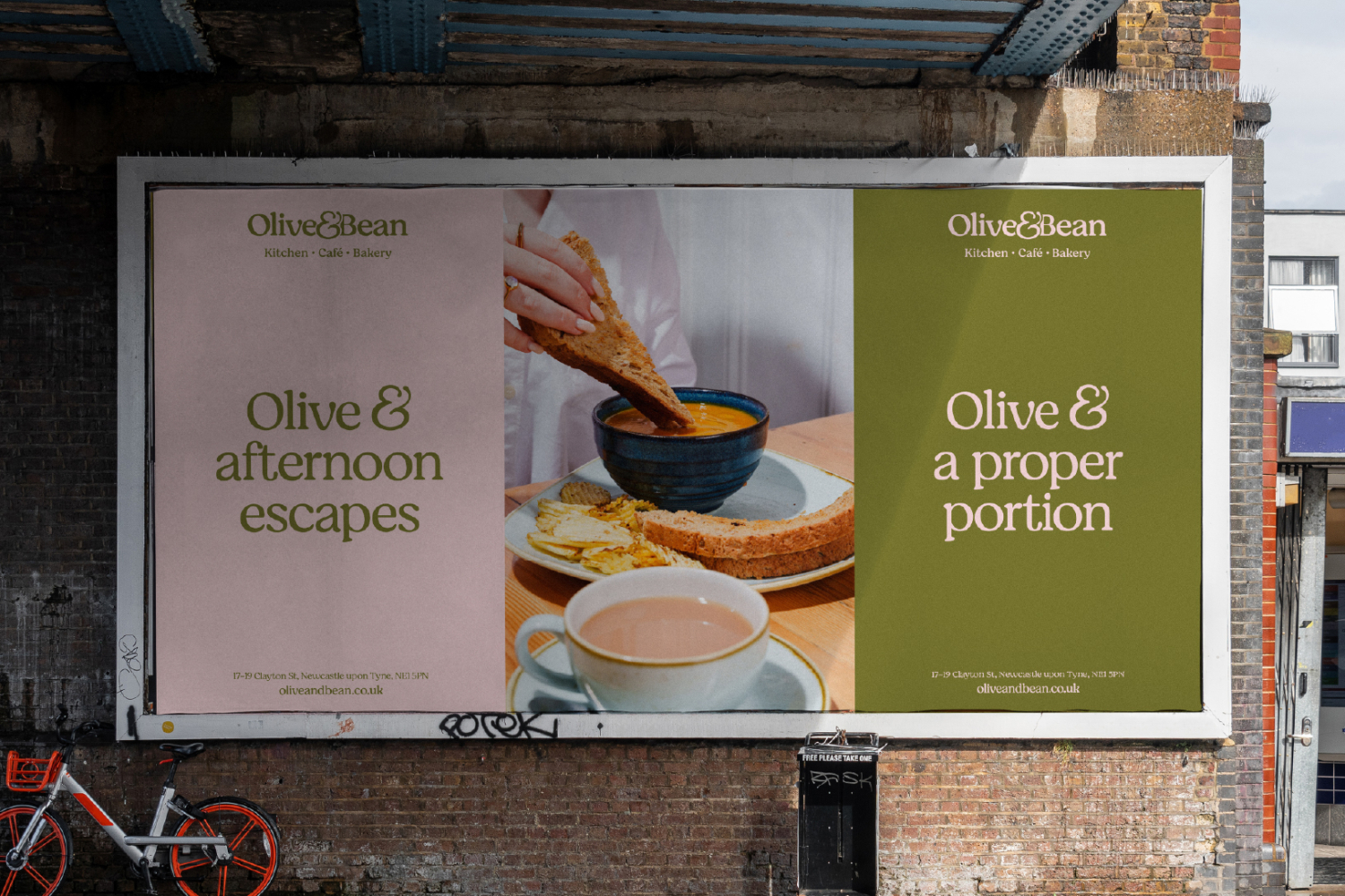
The ampersand became a playful tool to bring the tone of voice to life: Olive & a cheery hello. Olive & the community. Olive & big bakes.

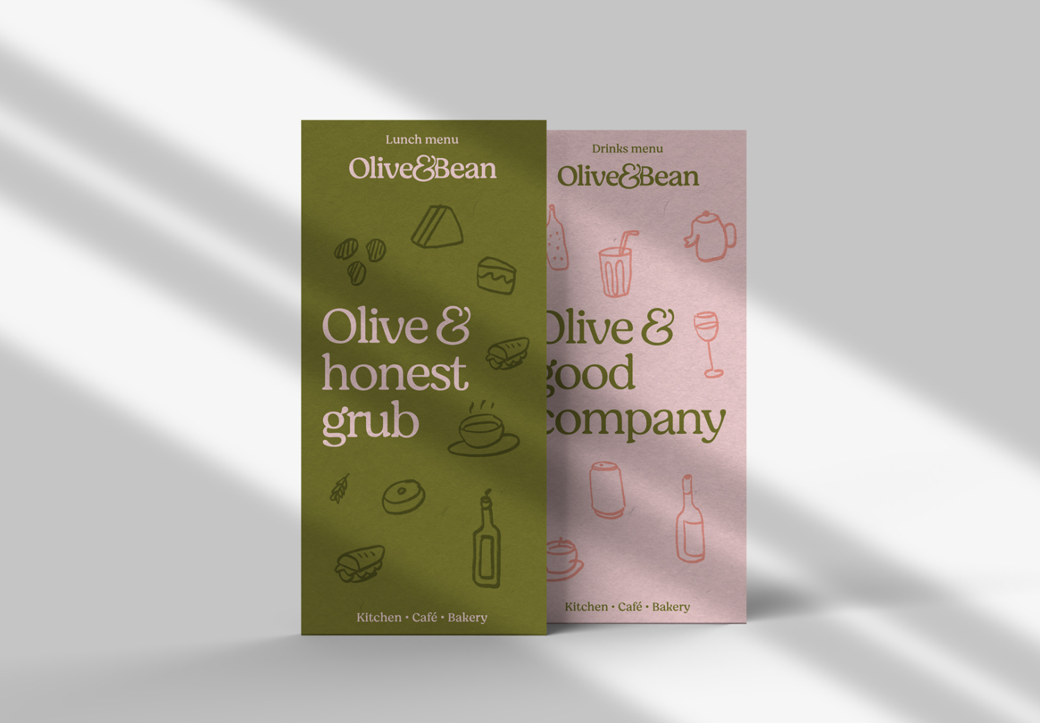
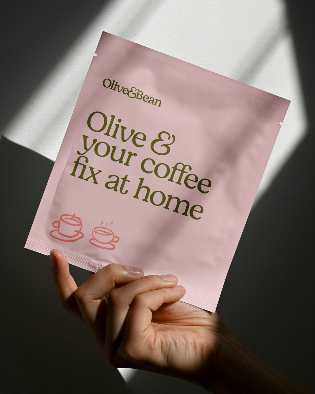
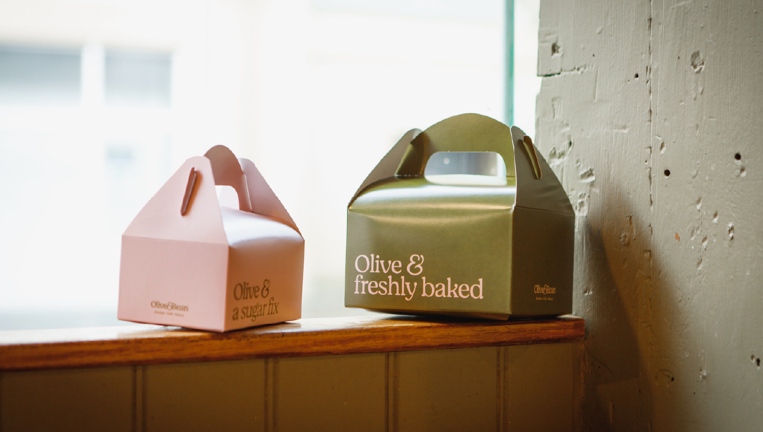
Paired with a warm olive green and blush pink palette, the refreshed identity feels familiar yet new, grounded yet full of warmth.

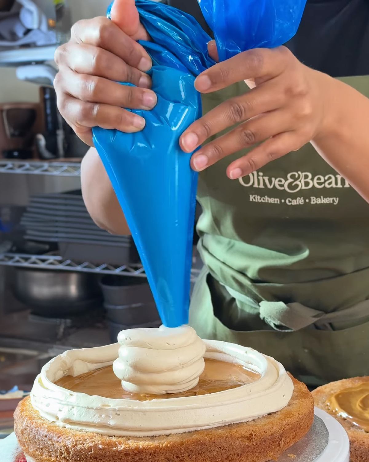
We’ve worked with the team to refresh everything from aprons, coffee cups, cake boxes and internal branding through to a brand new website showcasing their renowned menu.

The result is a brand that feels just like Olive & Bean: open, generous, and connected to everyone who walks through the door. Olive & family. Olive & friends. Olive & everyone.

Cafe branding
Cafe branding
Cafe branding
Cafe branding
Cafe branding
Cafe branding
Cafe branding

Internal branding photography by Anna Kemp.

Altogether
Privacy Overview

This website uses cookies so that we can provide you with the best user experience possible. Cookie information is stored in your browser and performs functions such as recognising you when you return to our website and helping our team to understand which sections of the website you find most interesting and useful.